A platform for six very different people
The Active Tracking Platform (ATP) had to serve six roles at once: Flex as the service provider, Admin for multinational visibility, Logistic Analyst for operational decisions, Shipper for barcode scanning, Receiver for real-time arrival tracking, and Carrier managing transport and delays.
The challenge was not just building a feature set — it was understanding that each role had a completely different relationship with the same data. An Admin wants a country-level overview. A Logistic Analyst needs to act fast on exceptions. A Shipper just needs to scan and register. Designing for one was easy. Designing for all six without making the interface feel like six different products stitched together — that was the actual problem.
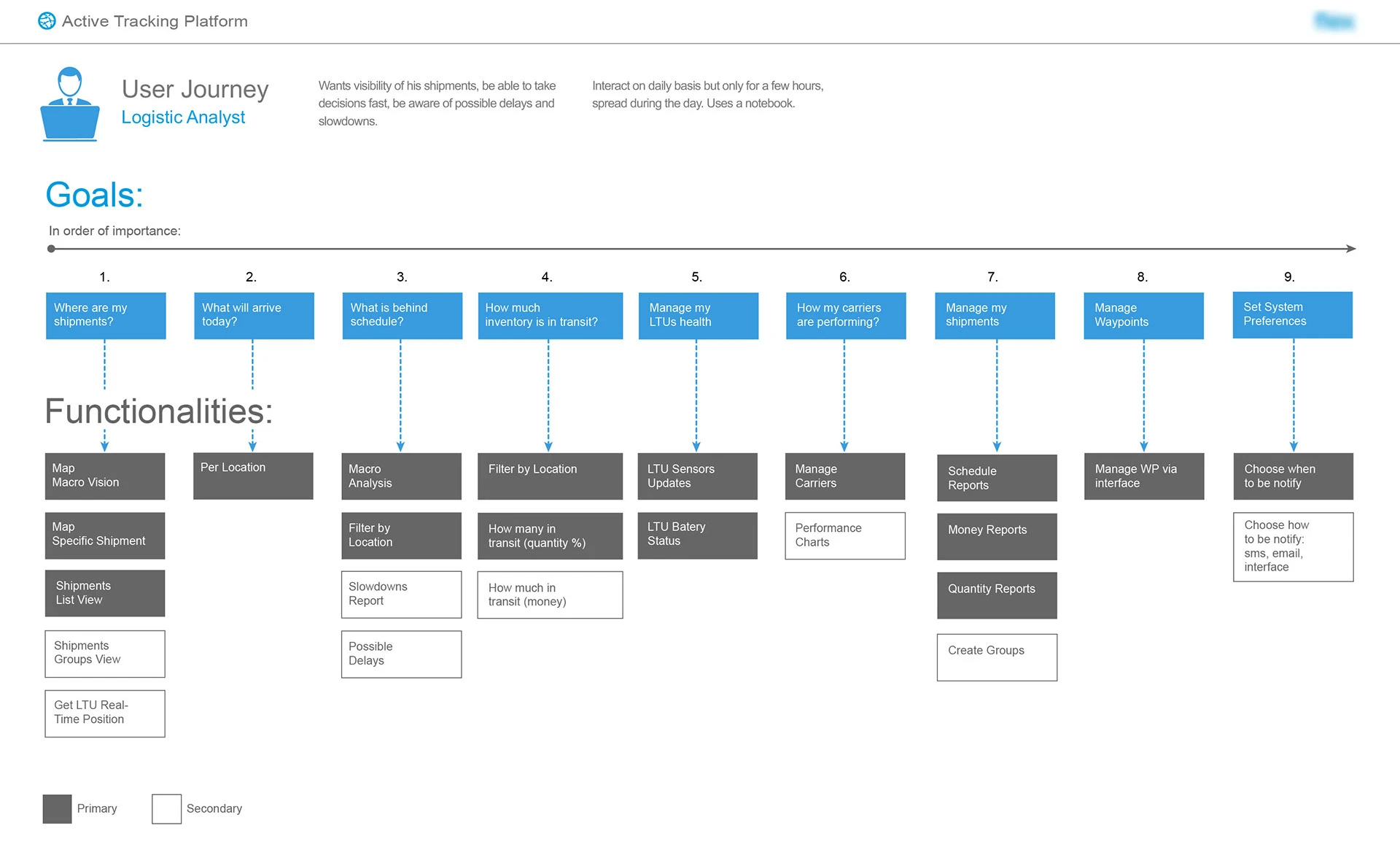
Mapping the Logistic Analyst journey
The Logistic Analyst was the most demanding persona: someone who works with the platform daily, in short intensive sessions, from a notebook, who needs to make fast decisions and catch delays before they escalate.
The user journey map broke down nine goals in order of importance — from "Where are my shipments?" and "What will arrive today?" to managing LTU health, carrier performance, and system preferences. Each goal was linked to a set of primary and secondary functionalities, making the feature prioritization a direct output of the research rather than a stakeholder negotiation.
This distinction between primary and secondary features was critical: it shaped the information hierarchy of the dashboard and ensured the most important answers were always one click away — not buried in a report.
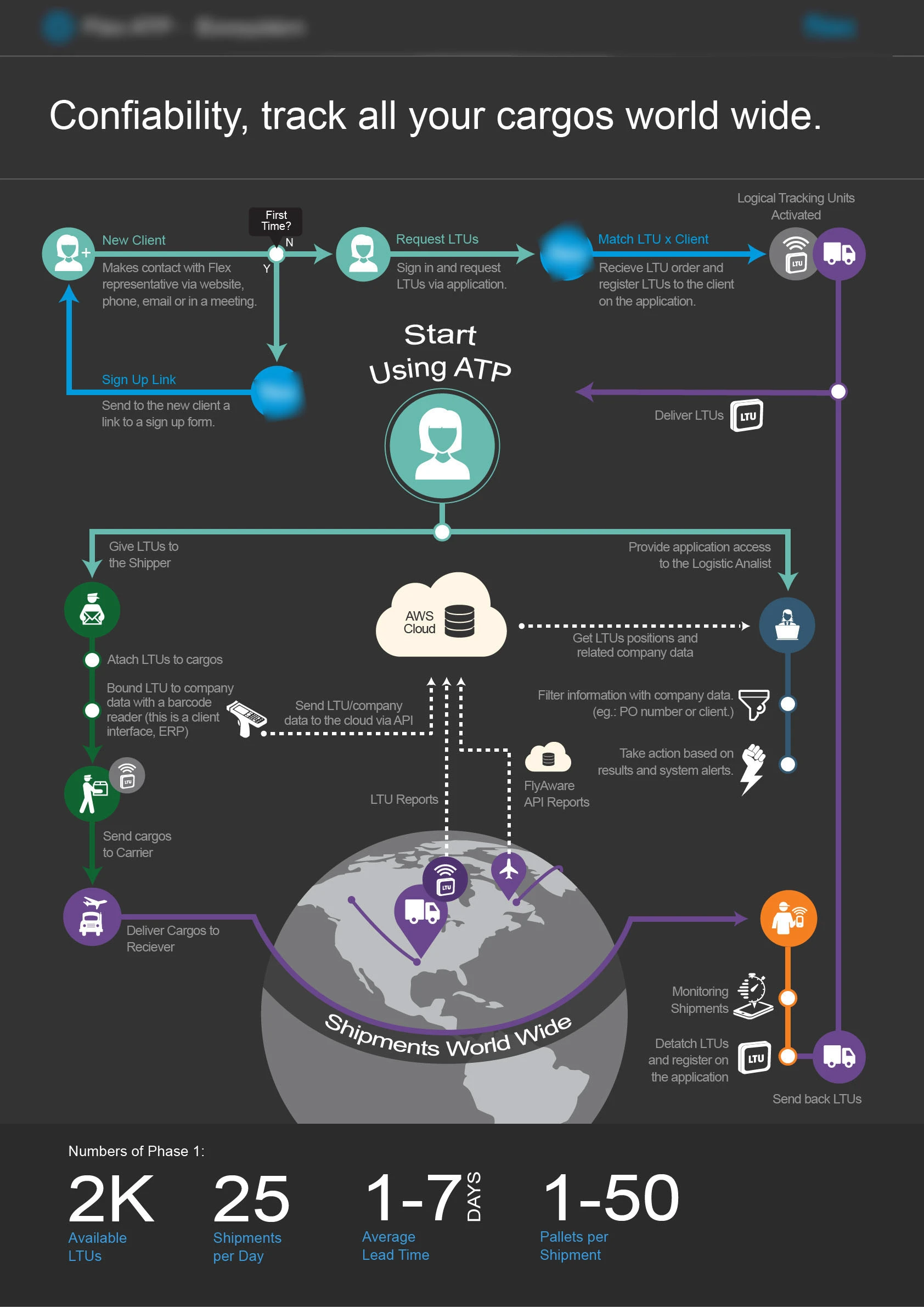
Designing the system, not just the screens
The full system flow infographic made the complexity visible before any interface decision was made. It mapped every actor, every touchpoint, and every data handoff — from the moment a new client contacts Flex, through LTU registration and barcode scanning, to worldwide shipment and final delivery.
The AWS Cloud layer at the center of the flow was not an afterthought — it was the organizing principle. Every role connects to it differently: Shippers push data via API, Analysts pull insights and alerts, Receivers confirm arrival, Carriers generate movement events.
Designing at this level first meant that interface decisions downstream had a reason. Navigation structure followed actor roles. Dashboard widgets followed decision frequency. Alert logic followed the exceptions that actually cost money.
Decision surfaces, not data displays
The biggest UX mistake in logistics interfaces is treating them as reporting tools. A screen filled with data is not useful if it forces the user to interpret before acting.
Every screen was designed around a primary question: what decision does this person need to make right now? For the Analyst, the map macro-view answers "where are my shipments." The slowdowns report answers "what is at risk today." The carrier performance view answers "should I trust this route tomorrow."
The visual hierarchy was built to surface the answer before the data — status, then priority, then detail on demand.